The Outlook Riding Academy
The Brief
The brief from Sam Remond was to help her establish a respected and prestigious boutique equestrian centre, catering for all ages and ability, on the Central Coast of NSW, Australia. The Remond family have included a team of horses for more than 40 years, both on the Central Coast and in rural NSW. Sam and her children have all participated in Pony Clubs, State and National competitions, Polo Cross, Eventing and Royal Shows. Sam wanted to bring the heritage that the family has built up over decades into the look and feel of the brand.
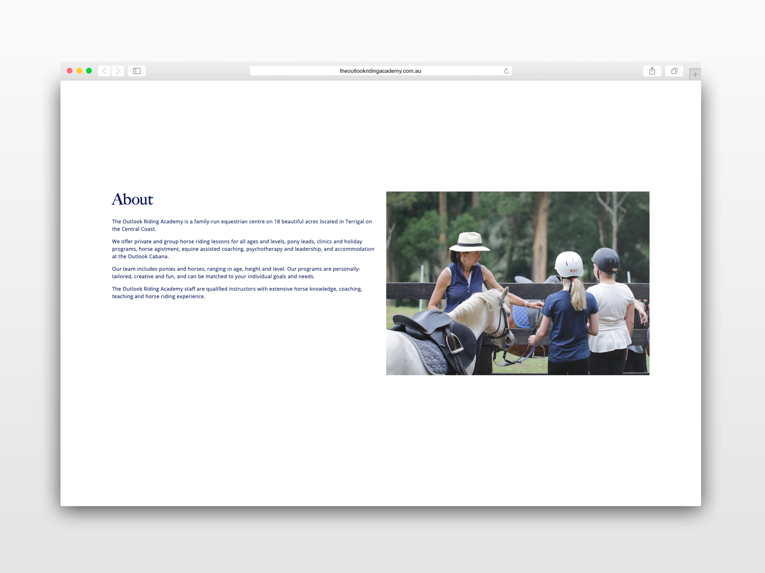
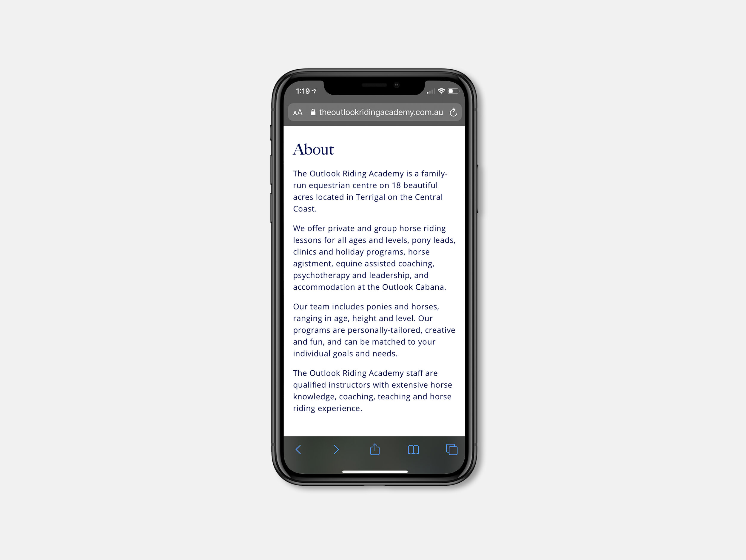
About
The Outlook Riding Academy is a family-run equestrian centre on 18 beautiful acres located in Terrigal on the Central Coast. They offer private and group horse riding lessons for all ages and levels, pony leads, clinics and holiday programs, horse agistment, equine assisted coaching, psychotherapy and leadership. The team includes ponies and horses, ranging in age, height and level. The programs are personally-tailored, creative and fun, and can be matched to everyones individual goals and needs. The staff are qualified instructors with extensive horse knowledge, coaching, teaching and horse riding experience.
Branding
The branding refers back to the heritage of riding academies and taps into the history that the family has with competitive horse riding. The brand encompasses the professionalism and prestige of the academy but also relates to the families past achievements whilst competing competitively over the last 40 years.
Colours
The colours of gold and navy are synonymous for being seen as professional, class, importance, intelligence and stability which are fitting for what The Outlook Riding Academy is as a brand. The gold colour is used in main header copy and accents, whilst the navy is used as a supporting colour in subheads and body copy.
Typography
When brainstorming ideas for the brand the use of a serif typeface came across as a very obvious choice to use in the logo and for the headline copy. Didone based Serif typefaces are associated with brands that are elegant, classic, prestigious and emphasises stability and professionalism. Those associations are the reason why the typeface ‘Big Caslon FB’ was chosen for the Outlook Riding Academy brand.
Opens Sans was an easy straight forward choice as it’s a typeface thats easy to read across digital and print formats.
Photography
In the super fast paced world that we live in today, the phrase ‘an image is worth a thousand words’ couldn’t be more true. Photography is more important than ever before in helping brands like The Outlook Riding Academy to tell their story, connect with new customers and building relationships with existing ones. The overall goal for the photography side of the branding was to capture every aspect of the Academy, both the behind the scenes and also the programs it offers. Allowing people a glimpse of what it’s like looking after horses, maintaining their equipment and stables helps build the Academy’s story. Photographing the programs the Academy has allows people to see what each lesson type offers, what themselves or the their children will be doing and learning during their time. It also helps build rapport with parents as they will receive photographs of memorable moments that themselves or children will have during their lesson or holiday program.
Website
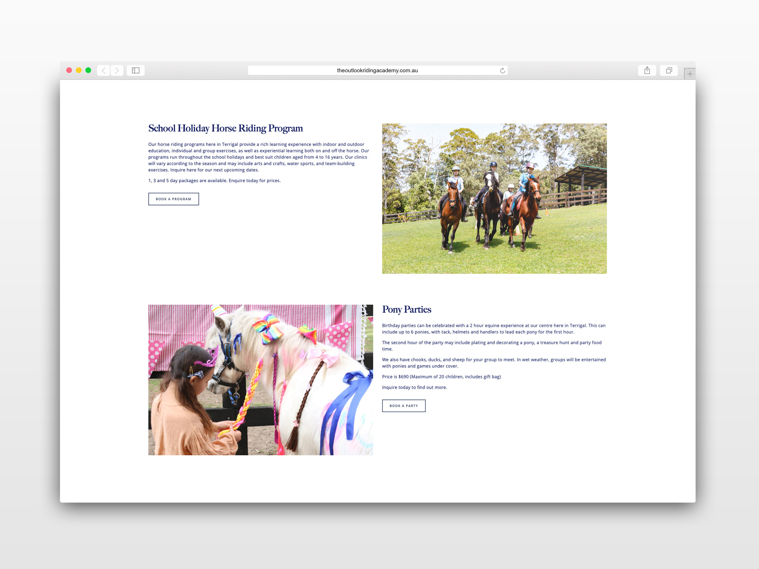
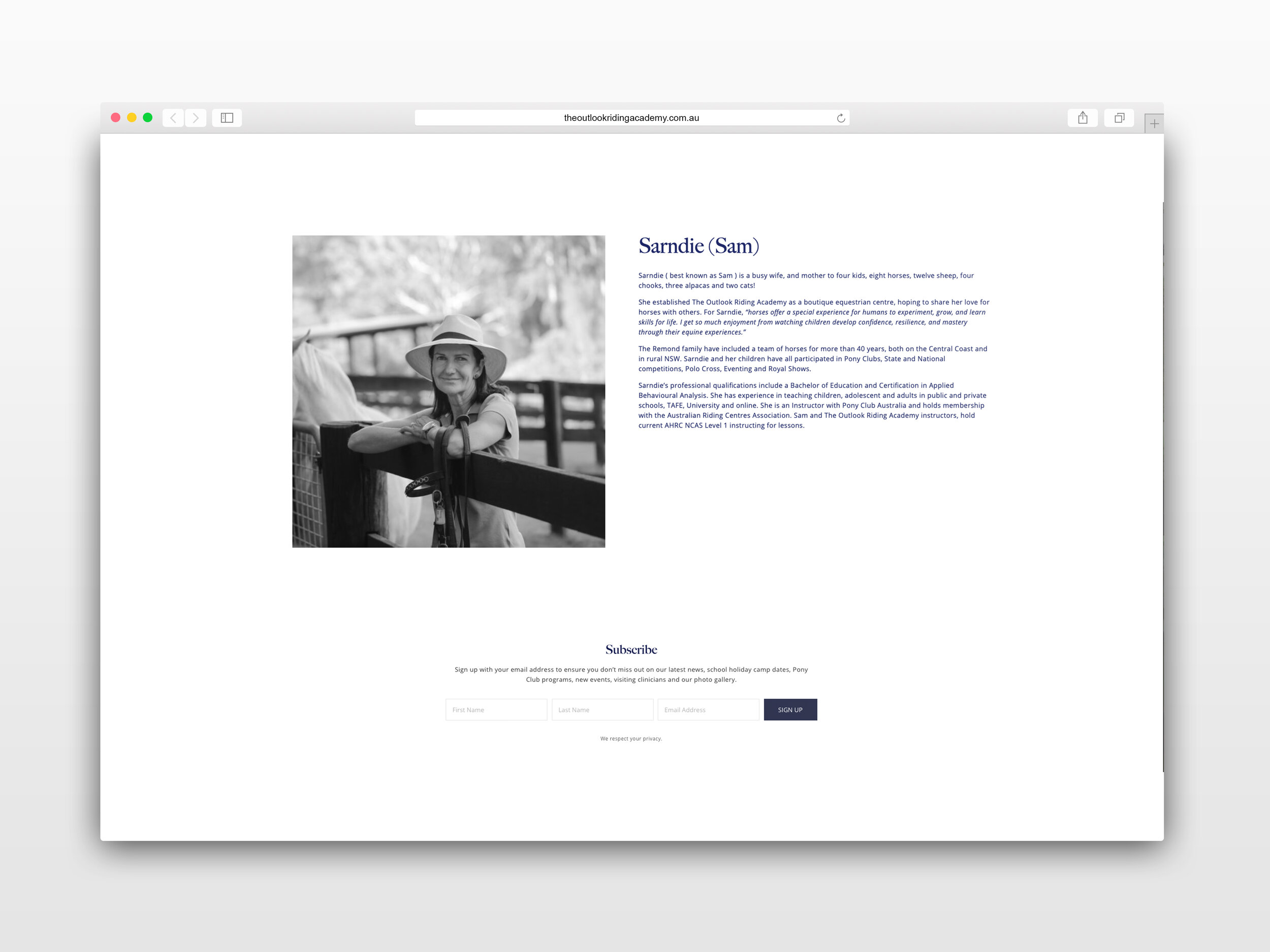
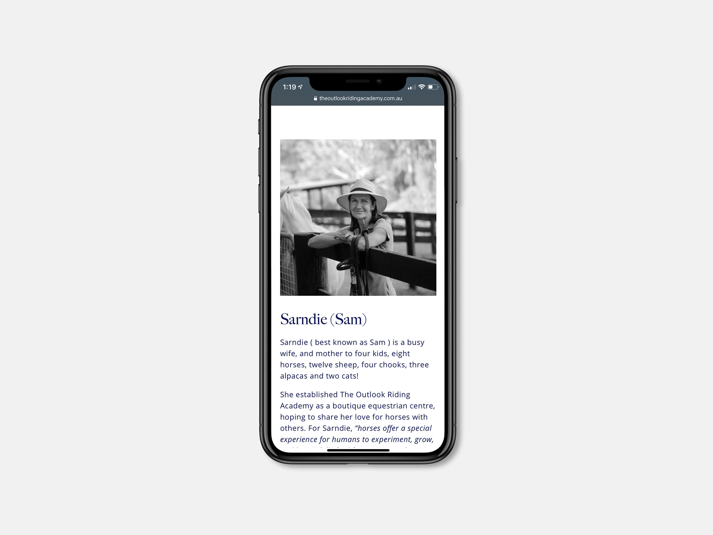
The website design was built around keeping things simple, easy for viewers to navigate, clear and concise copy, using large photos to do the heavy lifting when it came to promoting the business. Keeping a simple design made it easier for the website to be responsive across many different devices. One of the main requests from the client was to have a good CMS so that it was easy for them to maintain, update and add new features. With that factor in mind and the businesses rapid growth, going with a platform like Squarespace was a natural fit.





As with any branding process keeping a consistent look, feel and messaging across both digital and print is one of the key pillars to a successful brand. Over time having consistency creates brand recognition in the respected target markets. I designed the basic stationary, postcard sized brochure to be placed in local cafes and stores, posters for notice board, gift vouchers and many more print related items.


